Yesterday, the visuals of the Setouchi Triennale 2022 have been revealed. And they’re all sorts of awesome!
Before going any further, here they are:
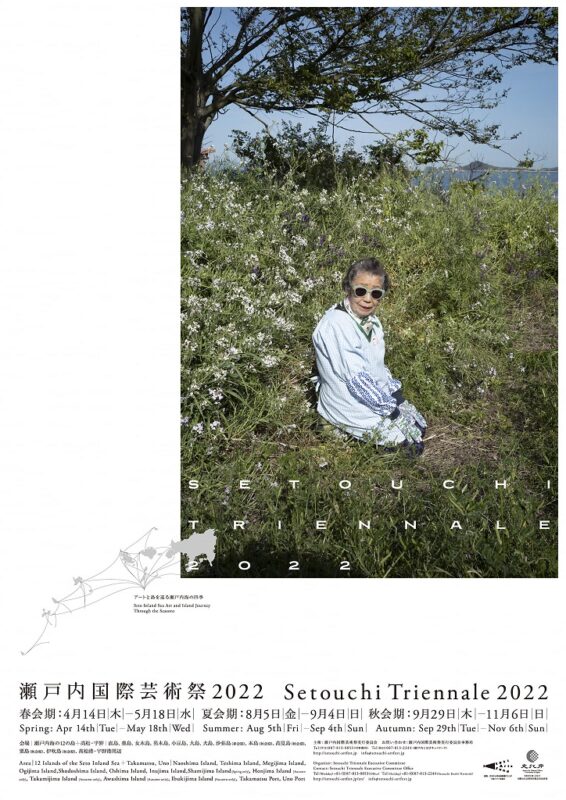
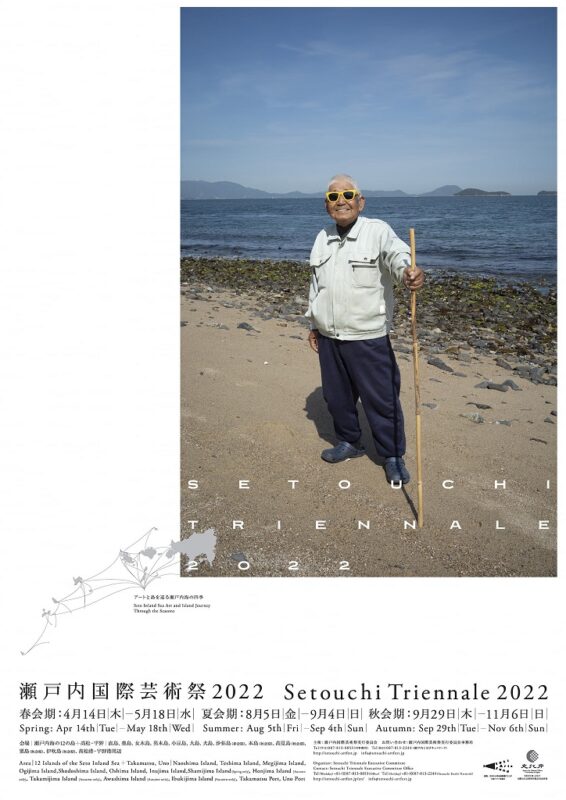
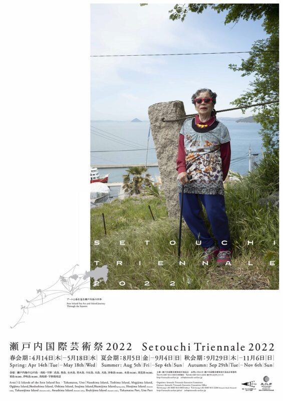
They sure are surprising at first, but I think that they really are the best choices for this fifth edition of Japan’s biggest art festival. And I’m not only saying this because I know these people (they’re all Ogijima islanders).
Let me explain as we’re revisiting the old visuals of the previous editions.
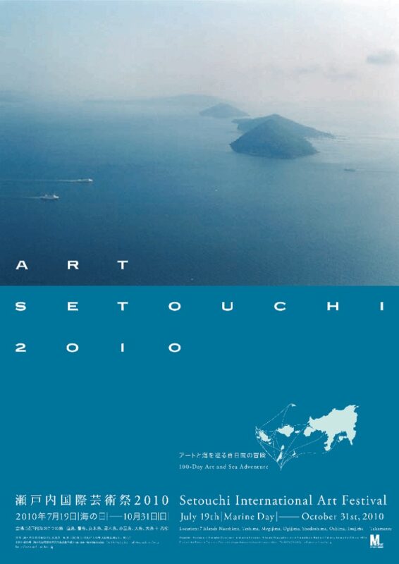
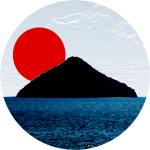
The original poster of the original Triennale, which was still called Setouchi International Art Festival back in 2010 was the perfect poster for this new festival. The poster clearly shows what this is about. It’s quite artistic. The poster’s main subject is a series of islands (Megijima, Ogijima, and Teshima in the background). It feels a bit abstract, no one really knows what to expect, but it is clearly about art and islands.
Personally, I really love it. It gives out a very dreamy and unreal atmosphere. One I had already experienced a couple of times before the festival and that definitely spoke to me. Actually, the very first visual identity of this very site had a similar picture that I had taken from Yashima a few months before. And even to this day, this current site looks the way it does, at least in parts, because of that original poster.
Also, note that this is not the only poster. Every edition of the Triennale had several posters. The other posters for 2010 depicted various island scenes: olives from Shodoshima, a small fishing port (I think it’s Ieura’s fishing port on Teshima), and an old lady (already) in the streets of Naoshima.
You can see them all on the archive page on the official site (where these visuals come from).
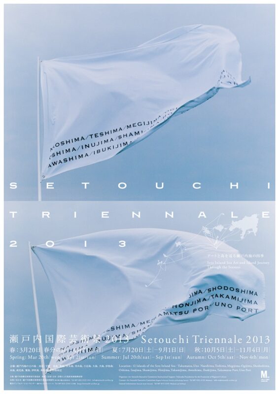
I’m much less of a fan of the 2013 visuals. The posters went full conceptual, with just some flags. There were three major changes to the festival from the first edition.
- The festival now has an official name in “English”: Setouchi Triennale (the Japanese name hasn’t changed, it’s still Setouchi International Art Festival in Japanese: Setouchi Kokusai Geijutsusai).
- It is now taking place over three seasonal sessions: Spring, Summer and Autumn.
- The number of islands taking part in the event went from seven to twelve.
All of these changes are reflected in the posters; the main one being the seasonal sessions as the flags were whitish for Spring (cherry blossoms), blue for Summer (blue skies and blue seas), and orange for Autumn (dead leaves).
Some people liked it, but I always found it a bit weak (conceptual art has never really been my thing anyway).
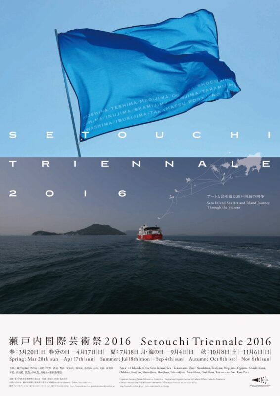
In 2016, one flag remains on the main poster (not on the other ones, once again, you can see all of them on the official site), but ferries are the main focus.
We’re still a bit in the concept, but at least, it’s a more meaningful one. The ferries are the figurative but also literal connections of the islands between each other as well as between themselves and the outside world. That was the main idea of these posters, and I think it worked.
Also, as Meon and Ogijima were part of the main visual, what’s not to like about it?
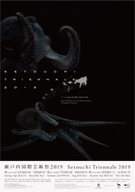
I have mixed feelings about the 2019 posters. I do like the pictures, but I find the move from blue to black a bit too dark. I’m not exactly sure why this change was made. But most of the people I spoke with liked them, so maybe that’s just me.
This time we’re leaving the islands to go see what’s happening underwater, as this time the stars are sea creatures from the Seto Inland Sea. However, they’re not any sea creatures. We have octopuses and fish (seabream and eel). In other words, they are edible sea creatures. The reason was that the subtheme of the festival’s 2019 edition was food, especially local food (a lot of it involves octopus and sea bream).
Why not?
Once again, I love the pictures, I’m not totally sure they work for the Triennale.
And now, we have the posters for 2022.
I said it at the beginning of the post, I’m saying it again: I love them so much!
They’re fun, they’re different, they’re unexpected and they make a clear and definite statement.
That statement is that the most important part of the Setouchi Triennale is not the sea. It is not the islands. It is not even the art! The most important part of the Setouchi Triennale is its people, and especially the islanders.
They are the reason the Setouchi Triennale exists in the first place. A thing that I noticed too many foreigners ignored in 2019 – the year when the festival really gained international recognition and really started to have a sizable portion of foreign visitors.
The islanders are the stars of the Setouchi Triennale (hence the outrageous sunglasses and makeup of the models). The Setouchi Triennale exists for them. It exists to revitalize their islands. And by “island” here, no one means the piece of land that constitutes an island. An island is not just a geographical space. An island also is a historical space, a cultural space, one or several communities and their respective cultures. Revitalizing the islands means keeping their cultures alive. The goal is to make sure that these elders can transmit all they have to transmit to future generations. It is to make sure that there are future generations on the islands.
This is also why I think all of the people on these posters are Ogijima residents (there could be more posters with more islanders from other islands, I’m not sure). Ogijima is the island that represents this revitalization the best among all of the Triennale’s islands. Its population increased in recent years! (something unheard of in rural Japan nowadays). The number of children went from zero to enough so that the school could reopen. Most of the new residents have become part of the community. They are not just there to benefit from the influx of tourists (most of them don’t work in fields related to tourism at all).
Also, I’m sure the current situation influenced that choice. The past year and a half have been taxing for all of us, but it’s been especially difficult for the elders in many ways. Celebrating them this way is just wonderful, and really puts a smile on my face. I hope it does put one on yours too.


By the way, I almost forgot. The photographer is Yoshihiko Ueda.
Stay tuned for more.
